
FAANG: A Comparison of the Titans of Industry
Analyzing Data pulled from the FAANG Stocks in an intuitive blog format
Introduction
In this blog post, we will be analyzing stock data pulled from AlphaVantage’s API, namely the FAANG Stocks (Facebook, Apple, Amazon, Netflix, and Google or Alphabet). I wanted to compare these stocks and see how some of the trends that these stocks followed. Since these companies have been grouped together because they are within the same industry, I suspect we will see some correlation but let’s see what the data says. If you would like to see how this data was obtained, please refer to my last post here. If you would like to know how to create these charts from the data, please refer to the link at the bottom of this post. Let’s get into it! (Also, I colored the charts that match the colors of the companies they represent)
Data Collection
First, one of the things I wanted to do was draw a line plot with all of the stocks overlayed, just to get a general idea of the data.
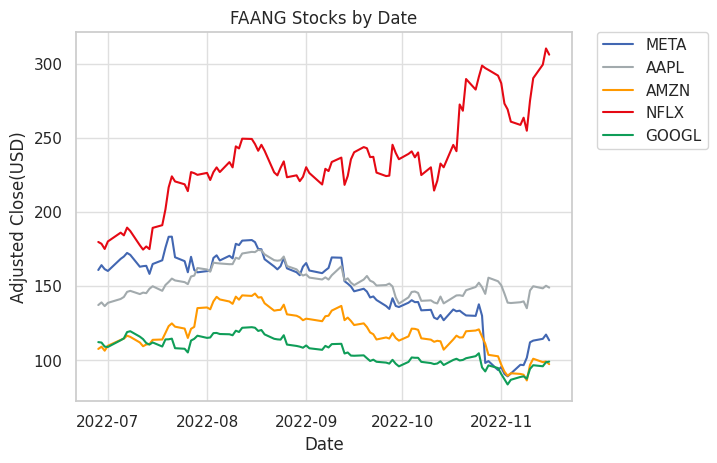
As shown in the plot, we can see all of the stock prices for the companies within the FAANG group. Most of the stocks have similar prices with the exception of Netflix, which costs more per share. It is important to note that during this time period, Google went through a 20:1 split and so the data has been adjusted accordingly to accomodate this split. Amazon also went through a split but not during the time period of the data and so has already been adjusted.
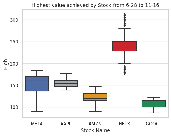
Next, I wanted to compare the differences of the intraday highs achieved by each stock which is shown below. Interestingly, Netflix was the only stock that had outliers, indicating over the course of the previous 100 days of stock trading (August 28th-November 16th is the time period for the collected data).
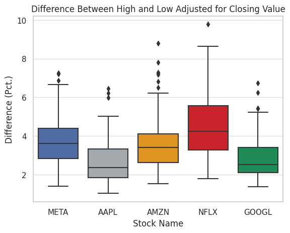
Another interesting measurement is to compare the intraday ranges for stocks. I calculated this by taking the difference between the high and low and divided this value by the adjusted close of the stock. This was done to account for the differences in price of the stock.
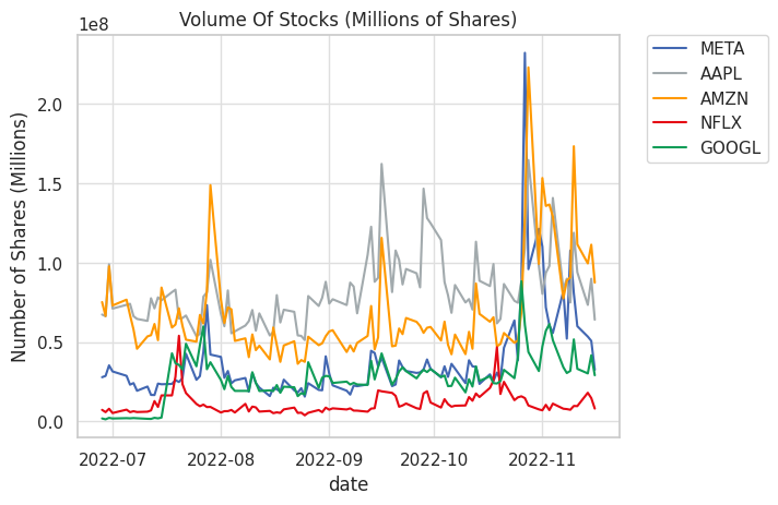
I wanted to compare the volume of the shares, which represents the total number of shares sold over the course of the day. As shown in the graph, many of the shares have similar amounts of traded shares. Often times, on certain days, the total amount of trading will spike, such as in the case of tech news or major economic news. In the increase of share volume, it may be an indication of news with the stock and is helpful in identifying events related to the stock.
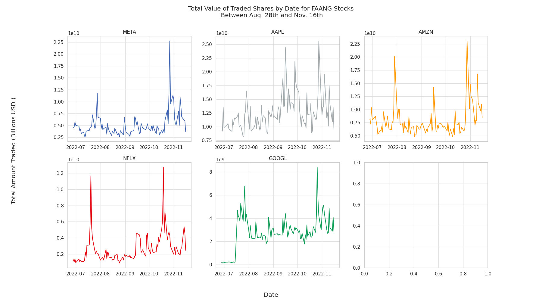
Finally, I wanted to compare the total amount of money traded per day. I created a plot that shows all of the plots that compares all of the shares and the total amount of money traded during the course of the day. That plot is shown below.
Conclusion
As shown by this data, we can see how related stocks will have some similar characteristics and it helps us to understand how many stocks are influenced by the movement of other shares on the market. In the next and final post, I will discuss how all of the data we collected turns into something that we can use to explain real life scenarios.
For all of the data used in this post, please visit the GitHub here